Saturday, December 20, 2008
Christ Among the People
Originally uploaded by millinerd
This was taken tonight at the American Boychoir School Christmas concert at the Princeton University Chapel. (Iconographical details available in the tags here.) The incarnation has many unforeseen implications. Merry Advent North American Churches readers!
Wednesday, December 17, 2008
Sold St. Nick
I wonder how the Hindus who have purchased the building will alter St. Nicholas in Edison. It'd be nice to get some pictures before we find out.
Saturday, December 13, 2008
A curious list of unusual churches with some North American examples.
Wednesday, December 10, 2008
Praisebuildings.com may not be the Institute for Sacred Architecture, but it's at least interesting, with a nice dictionary of ecclesiastical architecture.
Friday, December 5, 2008
Upjohn in Maine
First Parish Chruch, Brunswick
Originally uploaded by millinerd
Over Thanksgiving I was reading the world's best Brooklyn guidebook, and I saw that the first church Morrone lists for Richard Upjohn senior is in Brunswick, Maine. (Incidentally, the "untold" Buffalo church viewable immediately below is also Upjohn.)
Fittingly, I happened to be spending Thanksgiving in Bruswick, Maine. So I marched down the street and got some shots, and then snuck in on my way out of town during choir practice for some interiors. Who knew Upjohn worked as well in wood as in stone? And the glorious intricacy of those hammer trusses (I think that's the term) sure do show off the medium.
The statue near First Church is of Joshua Morrison. He lived in the cross-inscribed house across the street.
Incidentally, I like Francis Morrone so much that even I'm considering enrolling in one of his courses. These two sound thrilling.
I was also pleased to discover that nearby beautiful Bowdoin College has a handsome Chapel that is quite central to campus. Bowdoin even goes so far as to suggest that Nature's Laws are God's thoughts. Naturally. Not just nature's laws, however, but even nature itself all began as God's thoughts. Hasn't anyone read Question 15 article 1?
Friday, November 21, 2008
Untold Beauty Indeed
There's an interesting article entitled Saving Buffalo's Untold Beauty in the New York Times, but I challenge you to find the word "church." The way the caption to above image reads, it's as if they don't even exist. The author suggests that "the architects who worked [in Buffalo] were among the first to break with European traditions to create an aesthetic of their own, rooted in American ideals about individualism, commerce and social mobility."
I suppose that take on Buffalo architecture leaves little room for "European traditions" like Christianity. To correct the record, here are some pictures, chock full o' churches, that I took this summer.
Tuesday, September 30, 2008
I'm embarrassed that it took me so long to discover the Institute for Sacred Architecture.
Monday, September 22, 2008
Wholy Wholy Wholy (Foods)
My friend Justin sends this along regarding Harlem's gentrification.
White people are also hoping to close down things that they do not like, specifically churches. With over 100 houses of worship in the area, white people are concerned. Though the article does not mention why white people are upset at so many churches, it can be implied that they would feel more comfortable if they were to be replaced with condominiums, yoga studios, and white people churches (also known as Whole Foods).Sounds like a Harlem photo mission is urgent. Stay tuned for results from our recent Morristown, NJ mission.
Wednesday, September 10, 2008
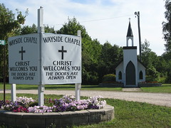
The Wayside Chapel
The Wayside Chapel
I'm ashamed to say I left out the most significant church in Ontario. It's a bit cozy, but very direct.
It is reminiscent of the millions of even smaller "wayside chapels" in Greece.
Tuesday, September 9, 2008
(mostly) Catholic Canada
This summer, by visiting a few more churches, I finally completed my Ontario and Toronto sets (at least for now). There are many gems in downtown Toronto, but the prize goes to St. Michael's Cathedral (info). The building is alive with art and devotion in a way that, sadly, many Protestant churches in Toronto are not. But one contender to Catholic dominance is St. Anne's Anglican (info), which is decorated by everyone's favorite North American artist posse, the Group of Seven. Come on now, look at that! (I've gotta work on my white balance).
Strangely, my picture of Trinity Church (made famous from the Cowboy Junkies Trinity Sessions) got drafted for some mapping site called Schmapp. What is that Schmapp?
A trip to St. Marie among the Hurons afforded an interesting attempt at indiginous Catholic architecture. Notice the martyr shrine is an upside-down canoe. There is a remake of the Jesuit mission nearby (the martyr shrine is in the background). There are actual relics of the great Jesuit martyrJean du Brebeuf at both sites. Also, don't miss Tim's priceless comment.
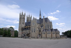
The greatest surprise of the summer, however, was the exquisite church in Guelph (info). But as this site shows, to get the best pictures, it helps to actually live there. Canada too often gets left out of the game, but she's just too good to forget!
Tuesday, September 2, 2008
Expressing the Liturgical Impulse
David Bains, of Samford University, accurately names it the "Liturgical Impulse." In his dissertation and forthcoming book, he describes the rediscovery among mainline Protestant demonimations of the sacramental and liturgical expression in worship - including architecture. It took place in the early and mid twentieth century. This was an all too short episode in which worship orders moved away from sermon-centered and included meaningful response on the part of the congregation. This was more than so-called traditional worship. A few churches do it today, fewer do it well, and a few of those are blessed with appropriate architecture and worship centers.
At Shadyside Presbyterian Church in Pittsburgh, a recent find revealed a part of the story of how its worship architecture came to be. See Undercroft Discovery
Wednesday, August 20, 2008
Nathan Glazer is right
Writing in his poignant book From a Cause to a Style, the eminent Harvard sociologist Nathan Glazer sums up our architectural predicament with sobriety:
"We can preserve the buildings of the past. We can't build them again. The language of the past can be admired and studied; its loss can be, and is, regretted; but too much has changed for it to serve us today. We are suspended between a language that cannot be used and a language - the language of modernism - that is unsatisfying for major public [and, I insert, religious] purposes, but for which we have no replacement."And so, let's start a blog devoted to appreciating the great, and at this point unrepeatable achievements of North American church architecture. Oh wait, we already did.But there is hope:"It think the first steps toward a more satisfactory language have been taken. We have developed a proper respect for the achievements in public building of the past..."
Thursday, August 7, 2008
Check out what Lance has done to Oklahoma City using the flickr tag feature (scroll over the image).
Monday, July 21, 2008
American Whitewash
One of my more unfortunate experiences with North American Churches is described in the fifth paragraph of this brief article.
Tuesday, July 15, 2008
Gracanica
Denise and I just got back from Kosovo. (I'd be rich if I had a nickel for every blog post that started like that.) Anyway, we were there to see the glory of Serbian church architecture, the handsomely exquisite Gracanica, and the experience was profound enough to alter our now matching (yes, it's disgusting) facebook profiles pics.
Now, lest you think that I've violated an implied rule of the North American Churches blog (only cover churches in North America), think again! The trip to Kosovo was only to prepare me for a visit to the North American Gracanica, located near Chicago. (There's also a copy in Belgrade that I saw last year.)
The copies are necessary because it's quite dangerous for Serbs (and until recently, anyone) to visit the church. As our guidebook put it,
"The enclave is under heavy KFOR protection, and unless you have personal contacts there, it is unwise to make any attempt to visit it."While we didn't have any contacts, we did find a much cheaper plane ticket out of Prishtina, and therefore figured it was at least worth a try to visit the place. The gamble paid off, as the situation has cooled down considerably, and aside from the barbed wire and guards, it was a regularly functioning monastery church. The inside is glorious, and though I'd like to have more pics, the nuns asked me not to take pictures within, and who am I to disobey a nun?
The lessons for North American Churches blog? A renewed charge to keep visiting churches, spurred on by the sobering reminder that we don't need to pass barbed wire and machine guns to do our work, for which photos are rarely an issue. Furthermore, a reminder that so much (all?) of the best New World churches owe an incalculable debt to the Old.
Press on!
Tuesday, June 17, 2008
Ralph Adams Cram's Unfamous Pittsburgh Church
This probably qualifies as a lazy man's posting, as I will refer you to one of my Flickr sets for the bulk of the content. Ralph Adams Cram's Calvary Episcopal and East Liberty Presbyterian are well known in Pittsburgh. Holy Rosary Church (Roman Catholic) is often overlooked. It was omitted from a recent book that purported to list all of Cram's work (however, this book cannot be noted for its careful editing in any case).
Although I had the privilege of worshiping at Holy Rosary, in preparation to teach an Adult Education class, my memory does not afford a comprehensive description. The congregation is predominantly African-American, as was the priest who celebrated the Mass. I arrived with two benign (I hope) stereotypes in mind. I expected the singing to be better and more vigorous than a typical Roman Catholic Church. It was not. I expected the homily to be better preaching than a typical Catholic sermon. It was.
I recall three details of the interior: Clever little fold-down "jump seats" at the end of each pew, presumably for overflow seating. A marvelous deep blue light from the rose window. FOUR confessionals.
Follow the Holy Rosary "set" here.
Thursday, June 5, 2008
How could Lance, our occasional Oklahama correspondent, have missed this?!
I guess it is a big state.
Wednesday, May 14, 2008
Saturday, May 3, 2008
Churches and Their Additions
A church addition is an intrinsically happy circumstance. It means that a body of believers is responding to either growth in their numbers or to a change in their ministry. Happiness is less intrinsic to the actual built additions. This has been increasingly on my mind over several years, as Shadyside Presbyterian Church has moved from seeking God’s will to presenting construction concepts (good ones) for Building Community. Early hints of an addition led to a feature on church growth on my website.
Not surprising, then, that a business appointment close to Sewickley, PA, led me to a lunchtime revisit to some interesting churches there. It afforded the chance to observe additions, old and new to three churches of historic architectural character.
When I arrived at Grace Episcopal in Edgeworth, I encountered painters at work on the front façade. This Joseph W. Kerr design of 1859 began life as Shields Presbyterian. Pittsburgh’s premier gothicist of the era produced a rectilinear block, with porch and apse appended to walls of tooled ashlar.
An early addition, the Shields family Mausoleum shows that neither materials nor details must be slavishly reproduced to have a sympathetic result. Indeed, the heavy masonry and stocky massing relate the 1893 Gothic Revival chapel to Richardsonian Romanesque, then at its apogee in Pittsburgh.
A walk to the other side of Grace reveals the quintessential mid-twentieth-century addition. I suppose that vestiges of the International style, contemporaneous ranch style homes and, perhaps, misguided stewardship led to so many flat-roofed “annexes.” At least, when they were “education wings,” they echoed the elementary schools then being put up. This 1958 structure appears to be well constructed and tips its hat (if it has one) to the church by wearing one pointed arch window. However, it verges on irony to claim that it honestly reveals its later construction.
A few block toward the commercial center of the village, I reached The Presbyterian Church. (Churches of this time seemed to like the proper definite article. I belong to The Shadyside Presbyterian Church.) J.W. Kerr designed this graceful sanctuary building in 1858. It has the same rugged, hand-tooled ashlar as Grace Episcopal, but assumes a picturesque, cruciform posture. When it was time for a parish hall in 1914, Sewickley was home to many architects. The Presbyterians were lucky to count partners Frank Rutan and Frederick Russell (alumni of H H Richardson and Longfellow, Alden & Harlow) among their members. The firm designed an effortlessly compatible Tudor Revival, to which later additions were well executed. A gothic Revival Chapel is tucked into the rambling structure. This church is embarking on a new building campaign, with excellent examples as a guide.
A lack of excellent examples is not a problem for St. Stephens Episcopal, on one of two main commercial streets in Sewickley. They did have some architectural excitement, when the sometimes volatile Ralph Adams Cram was asked to add to George East’s 1894 nearly-archeological Gothic Revival. Cram so infuriated the congregation and East that they turned to Alfred Branch Harlow. He was a church member and founding partner of Longfellow, Alden & Harlow, one of Pittsburgh’s favorite firms. He carried out changes, including a suave parish hall. A chapel and classroom spaces were integrated in a comfortable Tudor-Gothic mode.
Recently, however, a major addition was completed that brings to mind a Gothic strip mall. The half arches that surround its perimeter are awkward as a colonnade and implausible as flying buttresses. What appears to be stone trim may eventually weather well. Steel pointed arches span across the colonnade-buttresses. They read from either side as angle iron, attached with hex head bolts. These are materials that I use as a machine design engineer. (This photo shows that some upper stones are already discoloring, which might be good. However, it clearly reveals - at the corners -that the stone is actually a veneer a couple of inches thick.)
It must be said that from a distance the steel arches cast upon themselves interesting shadow lines. Unfortunately, from a distance, the crowded parking lot enhances the commercial look. The stucco and steel cornice flashing are at their worst where they join their venerable old ancestor sanctuary building. Almost any church addition needs time to settle in. I’m afraid the materials of this structure will deteriorate long before sufficient settling, if ever.
These Sewickley church additions are interesting to me, because of similarities of their neighborhoods to the one where Shadyside Church lives. Comfortable, historic and stylishly varied homes surround all of them. There are several lessons offered there to those engaged in church additions.
Saturday, April 5, 2008
The style of church the unchurched prefer is...
Lifeway Research, part of the Southern Baptist Lifeway Christian Resources, has conducted a survey of 1684 unchurched adults in America (defined as not having attended any religious services in the past six months). They were given four options of church styles to choose from, with the instruction to allocate preference points among the churches. The winner, by close to a 5 to 2 margin, was a Gothic cathedral style, shown in this graph.
Ed Stetzer, the director of Lifeway Research, was surprised, expecting modern, unchurched people to prefer the more contemporary style, which, actually, placed last among the four. He surmised that this was perhaps the desire for feeling a connectedness to the past.
Younger people especially prefer the Gothic look: "Those between the ages of 25 and 34 used an average of 58.9 of their preference points on the more ornate church exterior. Those over the age of 70 used only an average of 32.9...on that particular church exterior."
"'I don't like modern churches, they seem cold,'" said a respondent who chose the Gothic exterior. "'I like the smell of candles burning, stained-glass windows, [and] an intimacy that's transcendent.'"
Especially important for the consideration of those building churches, and salient for our project here, more than half of the respondents said a church's design would impact their enjoyment of a visit to a church. The interior, too, is important, for respondents allocated more than a third to the traditional Gothic nave look—more than double that for a contemporary theater setup.
This is an encouraging survey, for it shows that the appreciation of beauty has not been completely lost in America. And as this reminds us, beauty is one way that we can be drawn closer to God. It will be interesting to see how Southern Baptist megachurches respond to the issues raised in this survey.
Monday, March 24, 2008
Haddonfield United Methodist
I'd like to introduce the most subjectively beautiful set of church pictures I've yet taken, the church where I first heard the gospel and received it. I realize that such a statement is all too often the preface to a narrative of one's "outgrowing" such a gospel, but no such luck here. The message stuck.
But the imposing pillars of Haddonfield United Methodist Church (above) are not what I associate with that gospel. Instead it is the nearby youth parsonage. The massive Methodist church was where the adults worshiped, but the youth group - we knew it and the adults knew it - was different. We were more enthusiastic, less compromising, more "Evangelical."
Still, it struck me as I took these photos on a quick drive through town, that as much as we in the youth group thought ourselves separate, it was only because of the "establishment" wealth and financial commitment of the adult church that the youth ministry could hire such a gifted youth pastor (Kris Perkins) and flourish. I'm thankful then not just to the youth group, but to H.U.M.C. proper as well. The debt I owe the "adult church" is significant. The debt I owe the youth group for putting me in touch with such a vibrant form of American faith as a teenager (and hence putting me in touch with Christ), is incalculable.
Monday, March 3, 2008
Dallas
I enjoyed a very quick trip to Dallas. The end of this post should make sense of the above picture, not to mention these signs and this statue.
The beautiful brickwork of the Guadalupe Church was one of the more striking cases of architectural witness that I've seen. Dwarfed, it somehow holds its own, whether day or night. Christ in the city again.
The Wren-Gibbs style church at the Perkins School of Theology had a very Renaissance interior. Just up down the road on the spacious SMU campus was the impressive pick your pleasure worship service at the Highland Park Methodist. Very nice woodwork/stucco Gothic inside. This is but a side chapel!
Thursday, February 28, 2008
Bible Road
No Country for Old Men may have gotten the Oscar, but chances are most Americans, as they cross the great landscape of this country, don't encounter drug deals gone awry and murdered corpses. More likely they've seen something like the pictures laid out in Bible Road, a book with that quality so rare: reverence. I can think of no better role model for this blog enterprise than the keen and lovingly taken photographs of Sam Fentress. Most of the shots are of emissaries (in sign form) of our North American churches, but there are some great church shots in the book as well.
Not sure I'm fully on board with Jacob's ironic review. There is a simple, pungent beauty to these signs, in the most full-orbed sense of such an abused word as beauty. Can I articulate it? Probably not, which is fine. That's what the photographs are for.
Sunday, February 10, 2008
Shadyside Presbyterian Church
Following the adage that we should write about what we know, my inaugural post will feature The Shadyside Presbyterian Church in Pittsburgh. I am a member of this church which has been a profound blessing to me. That would make this posting a San Marco. Built in 1890, it is one of the best examples anywhere of Richardsonian Romanesque architecture. With the dual inspiration of H. H. Richardson’s Trinity Church, Boston and the Allegheny County Courthouse, the design was by his office staff-successor firm Shepley Rutan & Coolidge. Two years later, the Chapel was completed.
To an extent even greater than Trinity Church, Shadyside’s square central tower organizes the church inside and out. Like many lantern churches of the time, it was conceived as a preaching auditorium, with the central pulpit on a stage above the communion table. So it is remarkable that it works so well as a processional, divided chancel church – which it became in 1938.
The amount of explicit Christian symbolism found inside and outside the church is remarkable for a church in the Reformed tradition. These begin with the enigmatic regal faces at the entrance. They continue inside at the pulpit, lectern, table and font. As late as the 1950s, new symbols were added with the Parish Hall.
Two other visual representations command attention at Shadyside Church. The stunner for most people is the fiery mosaic of the Transfigured Christ in the apse. Notable by its beauty, it is a surprise in a Presbyterian church. (One visitor on a tour insisted that Shadyside was originally occupied by Greek Orthodox congregation.) A Tiffany window, present at the church’s completion, stands out in the nave, with balance of the stained glass installed as memorials after World War I. The narthex screen and the choir screen are skillfully carved. The indirect light of the clerestory windows contributes to a worshipful atmosphere.
Asymmetry, progressive additions and charming features, such as the pastor’s study tower, contribute to a rambling, picturesque composition. The monochrome ashlar and quieter detail (typical of Richardson’s later work) further distinguish Shadyside from Trinity. Cleaned of decades of Pittsburgh’s industrial soot, Shadyside Presbyterian Church rests comfortably on its corner lot in a residential setting, maintaining sight lines often lost in urban locations.
This church is where I learned most of what I know about architecture and worship. And so, I beg forebearance when, on future posts, I ignore the old adage and write about what I don't know.
Monday, February 4, 2008
Oklahoma City Churches—the Good, the Bad, and the Ugly
A good portion of my life was spent in Oklahoma City and the surrounding communities (the first 22 years, in fact). However, in all that time I only attended two churches—Sunnyside Baptist Church, and, once I was in college, Hazel Dell Baptist, where I was the pianist/youth pastor with Amy/church secretary/lawncare guy. I was happy to explore some of the churches in the area while home visiting family, for while I had driven by many, I had been in only a few. The sad truth of Oklahoma City is, that while there's often more than one church per block, most were built with no concept of architectural significance. Currently, there are more megachurches than I can count in the area, all of whom either have huge, cavernous spaces pointed to a stage/screen, or are converted stores (one used to be Wal-Mart), or both. But besides these new, huge structures, since Oklahoma just last year celebrated its centennial, most of the churches were built in the modernist period of architecture, or, even more likely, just in the simplest manner possible.
However, I did find some gems in the area (if you're in Oklahoma City and want to see them, I mapped them on Flickr). I haven't hit them all yet, but I got a good start. Firstly, I did have a San Marco at the church I grew up in, Sunnyside. The building fascinates me, mostly because I know the pastor who was instrumental in building it. Harry Boydstun, who was the pastor for much of my life, helped to build the current building in 1962. He was a fire and brimstone preacher, focusing so much on the law that I grew up utterly terrified of God. The building reflects his focus, for, rather than crosses in the sanctuary, there were lots of images of the Word. The only crosses were these two small ones on the communion table, which was interestingly hidden under a projector screen while I was there. The stained glass lining the nave was only abstract shapes, but the stained glass over the baptistry (which was hidden behind the projector screen) was an image of the Ten Commandments. While the church is an obvious product of the early 60s, in its defense is an interesting steeple, and, the sense of space provided by the high ceiling in the sanctuary.
I further received a Gaudi at one of the older downtown church buildings, what is now Citychurch. After wandering in the open door, one of the staff evangelists started talking to me, and then took me on a tour. Built in 1911 as the First Christian Church, the building is neoclassical, or, perhaps more correctly, Beaux-Arts, in its style (much like the bottom of the nearby Old Post Office). It was bought in the early 90s by Citychurch, a charismatic congregation, and, after sitting dormant for over 30 years, is again a thriving church. The building has a wonderful tin dome along with four smaller ones. The dome received some damage in the 1995 Murrah Building Bombing, but its interior and exterior are still original. The sanctuary itself shows the theater style that had become popular in churches, with a curved balcony around the pulpit. Most interesting in the sanctuary was the huge stained glass cross, seen from below and above, as well as in its context. The pews had been long removed from the nave, as had the large pipe organ from behind the pulpit. It did make me happy to see what was once a derelict building again a vibrant Christian community.
A Truro was mine at St. Paul's Episcopal Cathedral. The dean, the Very Reverend George H. Back, let me in and pointed out some notable features, but then he left me to shoot as he was off to lunch. Built in 1904, it's a Gothic church, albeit a simple one. It received even heavier damage from the 1995 bombing, but has been well-restored. It is not a large cathedral, as seen in this shot from the back of the nave. The altar area is nice, with two Tiffany windows, as well as a lovely Gothic altar. The balcony is taken up by the organ (which sounds fabulous—I worshiped here on Palm Sunday a couple of years ago). The pulpit, altar and font (as well as some columns) are all made of the same stone, which I believe Rev. Back said was Oklahoma granite. Its simplicity is appropriate for the time it was built, when Oklahoma City was barely a stop in the prairie.
The First Presbyterian Church gave me one more Truro. It fascinates me, for it was the only cruciform church I found (except for a chapel at a local Catholic school—but it was in the school's closed grounds). Built in the Gothic style, it was actually built in 1962—the same time as Sunnyside. Most notable in the church are its stained glass windows and its organ, a Mohler. The Rose window above the East transept (like most of the churches I went to, the altar is on the North) is a picture of notable women of the Bible. Further, there is a chapel attached that could be a church itself. I find this Gothic church interesting, in that it was built in only a couple of years. The stonework is not as good as others I've seen, although I couldn't quite place my finger on the reason. It felt more nostalgic than anything else. It was still a good example of a cruciform Gothic church, and unexpected in a city which was largely built after the Gothic revival.
Two Colognes were mine, at Old St. Joseph's Cathedral and the First Lutheran Church. Old St. Joseph's was the Roman Catholic Cathedral from 1903-1925. It seems like a pretty light brick Gothic. Its altar was not too ornate, although nice. The nave was made up of ribbed vaults (or, perhaps they were just painted on). First Lutheran's altar looks like its been altered through the years, with, among other things, fluorescent lights surrounding it. Its stained glass fascinated me because it looks so similar to the stained glass in Citychurch, above, and First Baptist, below—built in 1912, 1911 and 1910 respectively. The lights along the nave were trinitarian in shape, although also fluorescent. Its communion tables intrigued me, as they look like you actually sit at table to receive communion.
I also had three Chartres, at First Methodist Church, First Baptist Church, and at the new Roman Catholic Cathedral, Our Lady of Perpetual Help. And, finally, some Toulouse, at St. Francis of Assisi, Little Flower, and, not to be forgotten, Calvary Baptist Church. The next time I'm home, I hope to hit some of the other interesting churches. These were most of the older ones, but there are some truly creative architectural examples from later periods.
Friday, February 1, 2008
Scratching the Philly Surface
Princeton is 51 miles from New York, and 49 miles from Philadelphia. A rather ideal vantage point, and it will take many more trips to both cities to even begin to approach a comprehensive church photoset of either one.
My recent day in Philadelphia was paradisiacal. I grew up near near Philly and worked near it after college, hence the churches are captured over a layer of memories. On the way down I hit the shrine of the recently canonized Philadelphia Saint, Katharine Drexel, just off Rt. 95 (meeting a nun gave me the Gaudi). That was complemented by the rare design of St. Peter's Episcopal, with the wineglass pulpit on one end and the communion table on the other. I had it all to myself! I scored a Truro both there and (thanks to a friendly sexton) at Old Pine. Then came a ringing Gaudi from Mother Bethel AME, where I got a great tour and was able to see, arranged not unlike Katharine Drexel, the tomb of Richard Allen. There were many drive-bys as well. Is there a connection between Philly's Divine Lorraine and this picture from Newark?
That would have been a great day; but it continued. Then (with a little persistence) I got into the legendary St. Mark's, an Anglo-Catholic landmark, with a silver altar in the Lady Chapel donated (if I recall) by John Wanamaker of department store fame. Then came the massive Cathedral of Sts. Peter and Paul, and a sunset by St. Franics Xavier's by the Art Museum. A solid day.
As if that wasn't enough, on a trip to Ikea last Sunday, I was able to slip into the oldest church in Pennsylvania, Old Swedes', encroached by gentrification on the north end and strip mall sprall on the the south, but the park services has done a fine job of giving it some semi-monastic protected space. The cracked tombs all along the outside was like something out of a Stanley Spencer painting, a foreshadowing of the general resurrection. The shutters on the apse is such a nice colonial touch. The inscription on the way inside heightens expectations considerably, but they weren't disappointed. Again, I had the place all to myself, balcony and all. Don't other people realize how fun this is? The original furnishings such as the ship (above) and the angels added character. This was perhaps the first church in American where an organ was used, as early as 1703. It was all just too much.
Monday, January 28, 2008
Monday, January 21, 2008
Immediacy
The Germans may be well ahead of us in understanding that architecture is uniquely suited to communicating essential, otherwise silent aspects of the gospel. In his Monumentale Theologie of 1867, the German theologian Ferdinand Piper grasped this clearly. "Art," he tells us,
Let there be no doubt about the need for precision in theological language, if only for responding to theological errors, which because there exists an objective, actual God, are possible. Still, Hegelian hangover or not, Piper is right. While Christianity is dependent upon discursive theology to defend the perpetually assaulted specificity of God’s revelation in Christ, theology is dependent on architecture for something as well. Heaven is not a book club, but a Beatific Vision. I expect it will not involve digesting a multi-volume theological treaty. Heaven will, I imagine, be somewhat more overwhelming and immediate, comparable to one’s first sight of a Gothic Cathedral; while the first sight of an Evangelical warehouse brings to mind somewhere else.
has a thoroughly different form of expression than speech: it also addresses itself to the entire person, not through the faculty of concepts, but rather through the higher faculty of vision... The difference lies in the fact that, whereas in thinking the object is divided up, that is, the perception is a fluid one, bound to a series of moments, the work of art allows the whole to be recognized in its spatial entirety, undivided in the immediacy of all its moments.Piper then cites a remark attributed to Napolean. "Chartres cathedral might make an atheist feel uncomfortable" (hat tip for these references to this fine book).
Let there be no doubt about the need for precision in theological language, if only for responding to theological errors, which because there exists an objective, actual God, are possible. Still, Hegelian hangover or not, Piper is right. While Christianity is dependent upon discursive theology to defend the perpetually assaulted specificity of God’s revelation in Christ, theology is dependent on architecture for something as well. Heaven is not a book club, but a Beatific Vision. I expect it will not involve digesting a multi-volume theological treaty. Heaven will, I imagine, be somewhat more overwhelming and immediate, comparable to one’s first sight of a Gothic Cathedral; while the first sight of an Evangelical warehouse brings to mind somewhere else.
Monday, January 14, 2008
"Jesus Saves" counterpart
Wish I could take the credit for this one, it's a beaut. A friend took in on NYC New Year's. What's worse, he had just littered.
With posts like these this blog will become the sartorialist of churches. We're aiming high.
Wednesday, January 9, 2008
Heavy Laden?
A fellow flickerian, and contributor to the photo pool with the above shot of Renwick's masterpiece beckoning Atlas (note the sly title), sends along a brilliant quote from Ludwig Wittgenstein:
"Architecture immortalizes and glorifies something. Hence there can be no architecture where there is nothing to glorify" (Culture and Value, 69e).One might think that contemporary architecture's claim to not tell a story sidesteps this rule. But despite such narratiphobia, starchitecture is as committed as ever to glorifying its maker. On this score may I recommend Michael J. Lewis' article The rise of the "starchitect".
I for one prefer buildings, like St. Patrick's Cathedral, that glorify its maker's Maker.
Saturday, January 5, 2008
Five Spire Rating
I'd like to recommend the five spire system to rate churches. Not the churches themselves, mind you, but to rate how well we imbibe them. Feedback is welcome.
1 spire ("the Toulouse"). A simple drive-by shooting, like this. Sometimes you have to settle for the Toulouse, as it's better for the church to get the drive-by than the photographer. We actually saw a police chase on that trip.
2 spires ("the Chartres"). Multi-angle exterior photography on foot, as with this abandoned church just before the Holland Tunnel.
3 spires ("the Cologne"). Exterior and interior photography, as with Trinity Church in Princeton - be sure to see Lance's as well, for this was the inaugural joint mission of the North American Churches group.
3.5 spires ("the Truro"). Exterior and interior photography including balcony or other normally closed spots, and/or busting out the tripod (mono-pod won't get you the half-spire). By talking to a kind janitor, I got upstairs in St. George's Orthodox Church, Toronto with tripod at full extension - "the Truro" was mine. If you know of a more apt example of a 3.5 spire church than Truro, do tell.
4 spires ("the Gaudí "). An actual tour, however informal, given by an informed parishioner, janitor, pastor, etc. We scored a ringing Gaudí at Peddie Memorial in Newark by meeting the pastor who described his very challenging ministry and showed us around.
5 spires ("the San Marco"). In keeping with rule #2, worship in the space in addition to all of the above. I scored a San Marco at the O.G. this summer, and you can read all about it.
Now when someone says, "I scored a chincy one spire drive-by when I wanted a San Marco, but the church was closed; I'm a real Toulouse-er," you'll know what they mean. But let's hope it never comes to that.
Tuesday, January 1, 2008
a matter of gospel
For an inaugural quote to communicate the urgency of this blog enterprise, here's a lift from this fine book:
Architecture for churches is a matter of gospel. A church that is interested in proclaiming the gospel must also be interested in architecture, for year after year the architecture of the church proclaims a message that either augments the preached Word or conflicts with it. Church architecture cannot, therefore, be left to those of refined taste, the aesthetic elite, or even the professional architect.
Subscribe to:
Posts (Atom)